Features
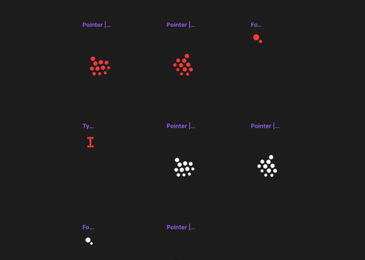
Nanite Cursor
I built the nanite curso to alter its shape using nanite dots. it can form anything you need try it on the site preview.
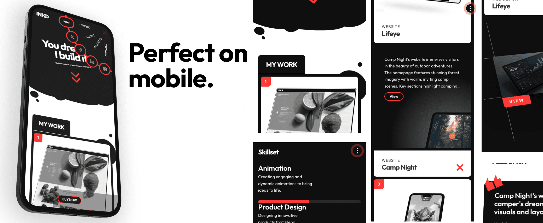
Popout content cards.
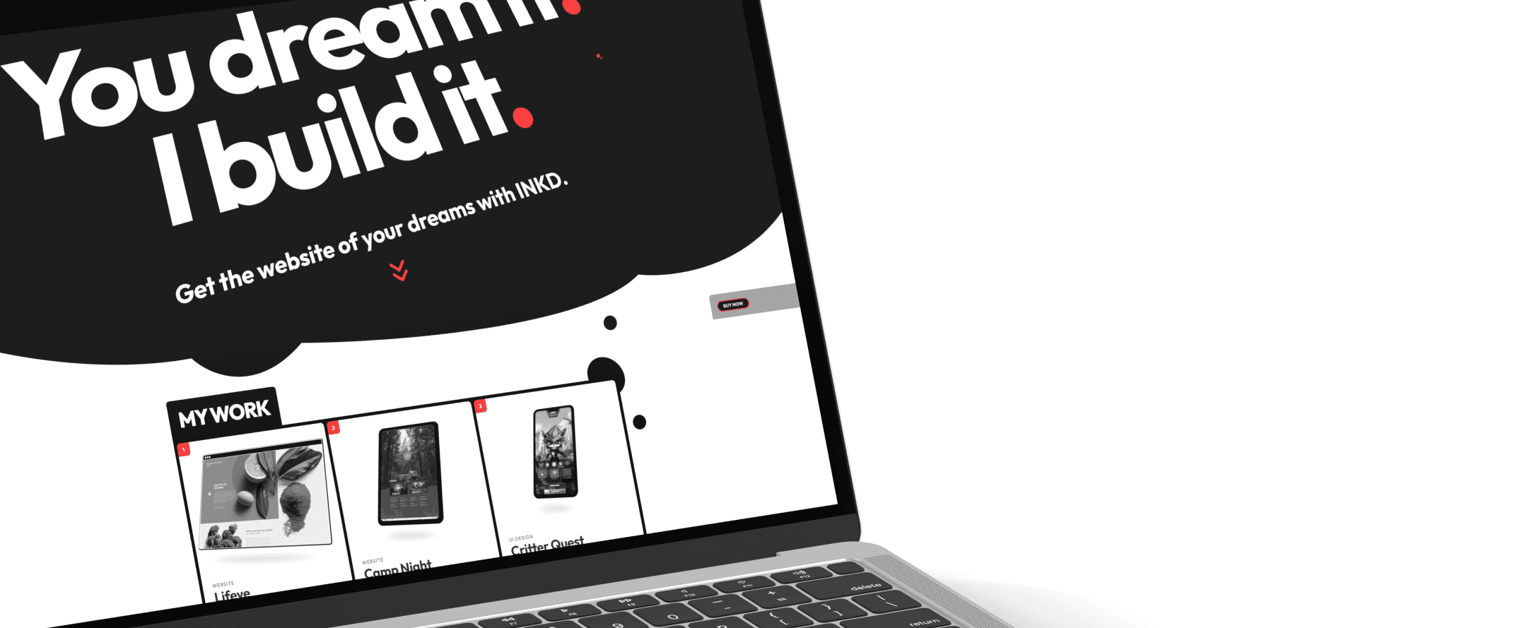
The work cards component is a multi-purpose tool that can be a browser, tablet, phone or page. The pop-out image and transition from grayscale to full-color give an excellent £D feel with cursor follow too.
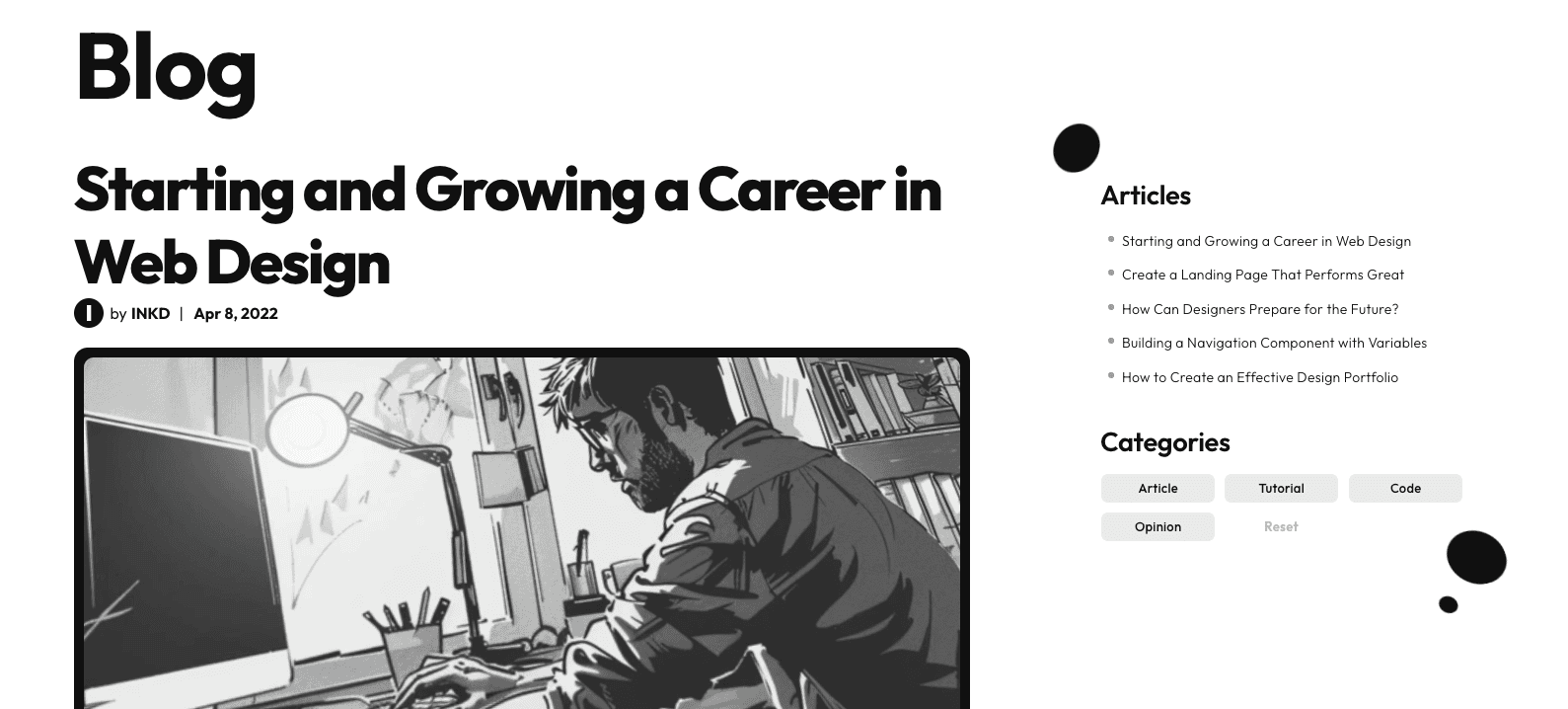
Clean blog layout.
The blog has a clean simple layout ideal for the occasional blogger. The side-bar features more articles and category tags and everything works from the custom code share sheet to the dynamic readtime.
A very unique menu.
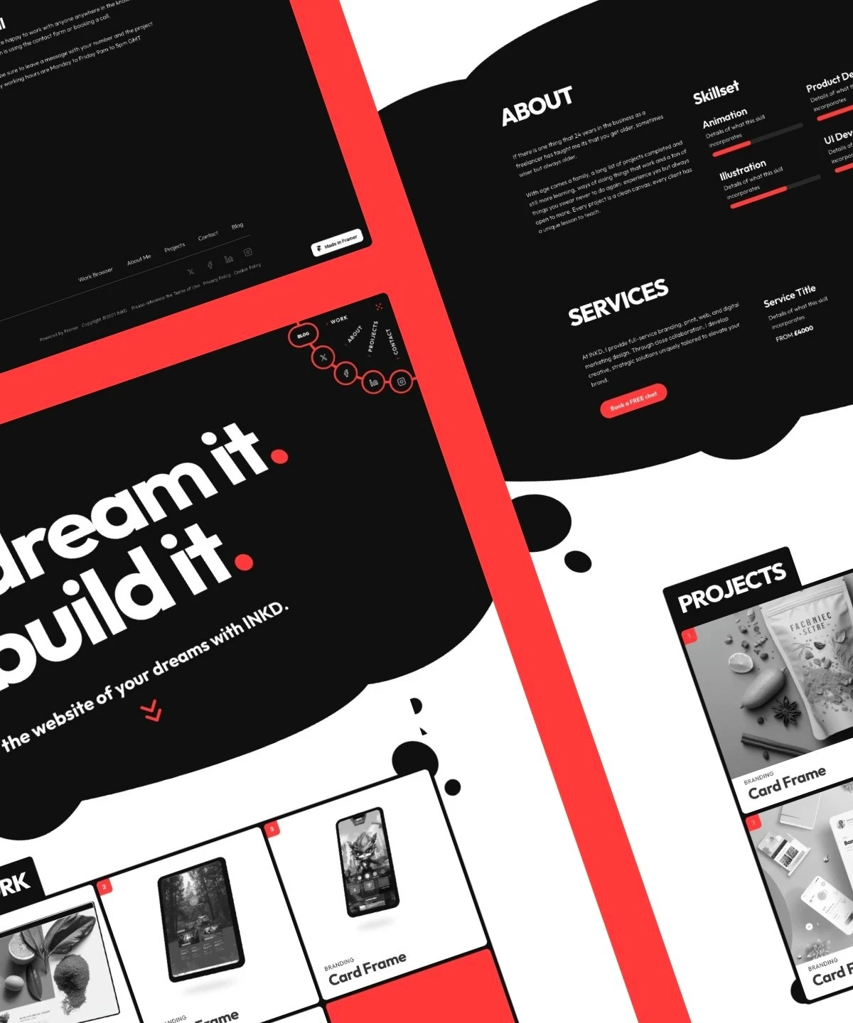
The corner rotation menu suits a small number of options and works hand-in-hand with the nanite cursor.
Super slick project cards.
Another cool card transition in the projects sections shows just how flexible Framer components can be with a little imagination.
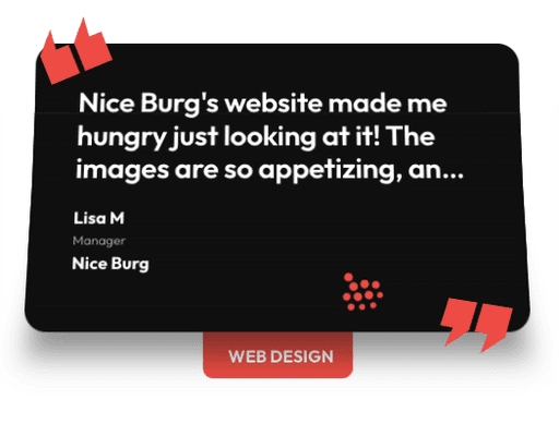
Paper feedback cards.
Paper feel feedback cards with custom code truncation overrides use the Framer transform features to bend the cards with a 3D feel.
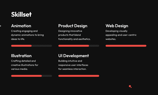
Animated skill bars.
A simple 3D transform creates the illusion of animated progress bars, simple bu effective.
