Case Study

Literal.ai

How I helped these guys improve and fix their Framer site.

Back

Case Study

Literal.ai

How I helped these guys improve and fix their Framer site.

Back

Case Study

Literal.ai

How I helped these guys improve and fix their Framer site.

Back

Project Details

Client:

Literal Ai

Type:

Fix & Improve

Objective:

Build a custom site on a budget and fast.

Tools:

Figma, Framer

Overview

Having helped the excellent guys at Literal.ai with some improvements to their initial site they now needed some special treatment to the homepage, blog and pricing sections of their website.

On the homepage they wanted some subtly animated bento boxes, the blog needed an improved layout and additional features and the pricing section needed a detailed offering section. Here is what I did.

Features

Hero updates.

The hero are was updated using some pre-built content my job here was to get it to match the style of the site.

Animated Bento's

This was one of the main improvements to the site. I created a series of animated-on-hover bento animation all using Framer's built in animation tools and some simple screen grabs.

New pricing cards and table.

The pricing card structure was completely updated allowing for annual/monthly switching but also adding a click to open pricing table. The table is fully responsive and allows for instant access to the full "what you get details" if needed all in one place.

Subtle animated table.

Using masking we show the table tops to let the user see there is more information if they need it.
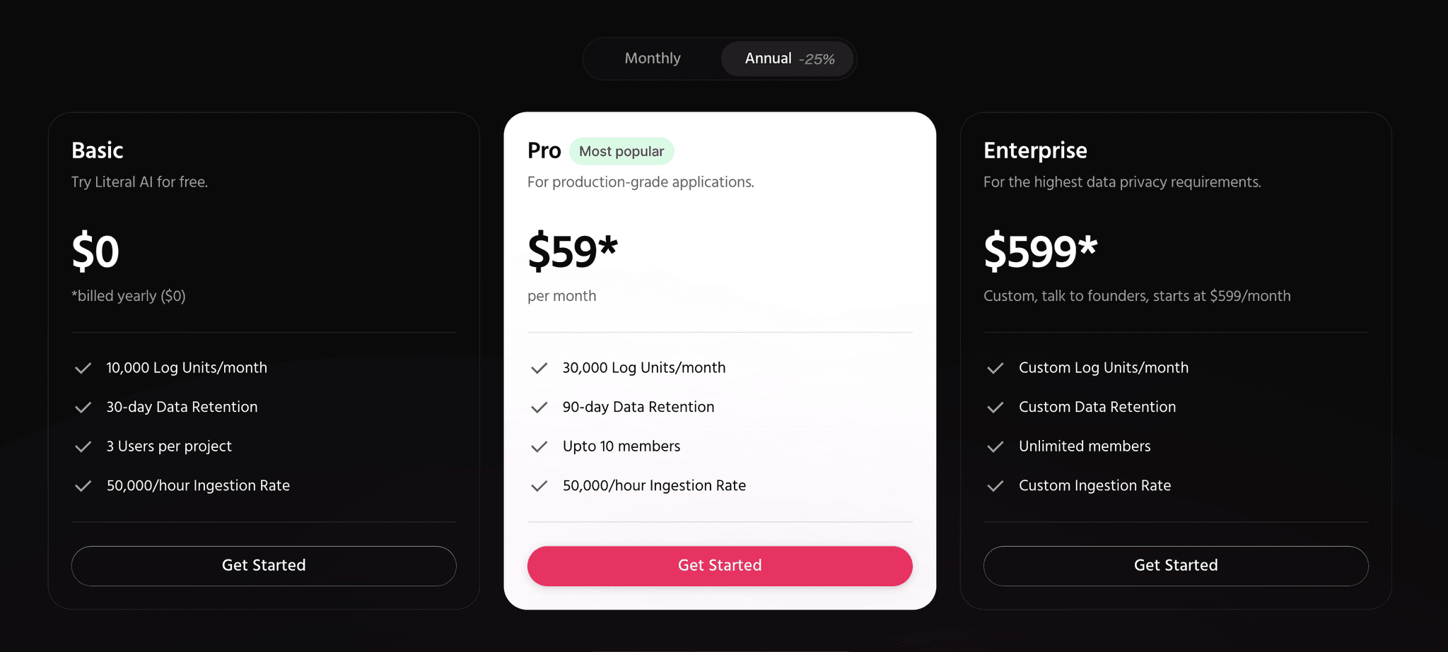
Blog improvements.

The blog has been completely overhauled with new layouts for all devices giving a featured article section, sub lead articles and then the general article list. I also created a visual style for the article thumbnails with an editable Figma file to allow the Literal Ai team to create their own images using the same styles.

The blog detail pages have a complete new layout that is clean and easy to read. Added my custom read-time overides and a fully active sharesheet as well as additional article sidebar and blog specific typoe styles.

How it worked out.

Although this was not a full build it was a "please fix our Framer site" request which ended up being quite extensive. The new animated bento boxes hero section and other improvements were implemented in just two days and on budget.

The client was very happy with the results and can now continue adding content with confidence.

What my client said.

We love working with Chris his enthusiasm for our project and his ideas and implementation are always spot on. Looking forward to working together again in the future.

Dan Constantini

Co-Founder and CEO - Literal Ai

How it worked out.

Although this was not a full build it was a "please fix our Framer site" request which ended up being quite extensive. The new animated bento boxes hero section and other improvements were implemented in just two days and on budget.

The client was very happy with the results and can now continue adding content with confidence.

What my client said.

We love working with Chris his enthusiasm for our project and his ideas and implementation are always spot on. Looking forward to working together again in the future.

Dan Constantini

Co-Founder and CEO - Literal Ai