Chris Kellett
Read time
- 0 min read
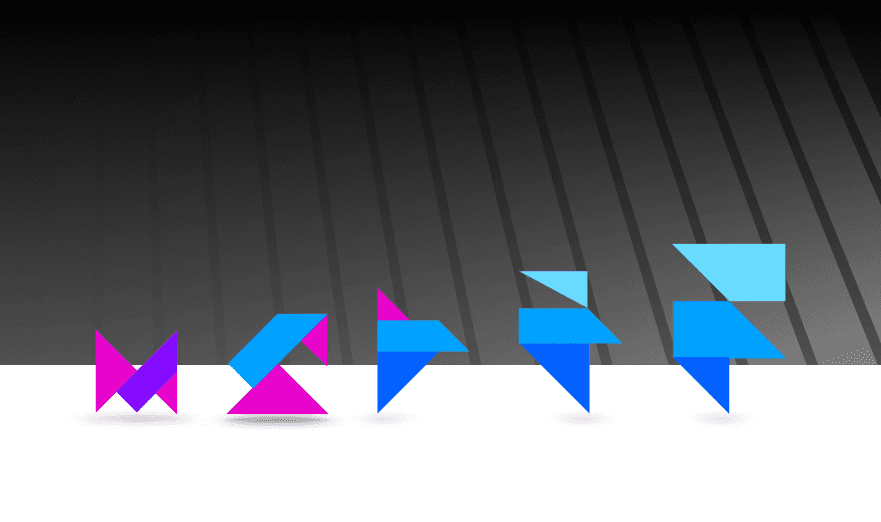
Framer has transformed from a JavaScript framework into a top-tier no-code platform for designers and developers. This article covers its key milestones and explains why it remains my go-to tool for modern interactive design.
Early 2010s: Framer.js – The Beginning
Framer’s story begins with the release of Framer.js, a JavaScript framework developed to help designers quickly prototype animations and interactions. This early version was groundbreaking because it gave designers the ability to translate their ideas into interactive prototypes using code, rather than relying on static visuals.
This combination of design and code set Framer apart from other tools at the time, as it bridged the gap between design and development.
2014: Framer Grows into a Comprehensive Design Tool
By 2014, Framer evolved from its humble beginnings as a framework into a more robust design tool, combining visual editing capabilities with the power of coding. This shift made Framer much more accessible to designers who wanted to explore interactive design but didn’t necessarily have a strong coding background.
The tool started to gain traction in the design community, thanks to its unique ability to offer a deeper level of interaction beyond static mockups.
2018: The Launch of Framer X
2018 was a pivotal year for Framer with the introduction of Framer X. This new version brought significant changes to the product, positioning it as a more scalable and modular tool. Framer X embraced code structure, allowing designers to build highly interactive and responsive prototypes.
One of the key innovations was the integration of React, a popular JavaScript library, which gave users the power to create dynamic, data-driven prototypes. This marked a turning point where Framer transitioned into a tool that not only focused on visuals but also on performance and flexibility.
2019-2020: Framer Motion and Animation Breakthroughs
Around 2019, Framer introduced Framer Motion, a library specifically designed for React that significantly enhanced the tool’s animation capabilities. With Framer Motion, users could create complex, smooth animations with minimal coding effort. This was a major step in making the tool more accessible to designers who wanted to add advanced motion design to their prototypes without diving into heavy coding.
This period also saw a broader adoption of component-based design, allowing for reusable elements and streamlined workflows. Designers could now create systems that were not only visually appealing but also functional and scalable across multiple platforms.
2020-2021: Framer Web – Bringing Prototyping to the Browser
The next major leap came in the form of Framer Web, which launched around 2020-2021. This move brought the full power of Framer into the browser, making it more accessible to a global audience of designers and developers. The browser-based platform meant that users no longer needed to download software, making collaboration easier and more efficient.
With Framer Web, prototyping became faster, more intuitive, and accessible from anywhere with an internet connection.
2022-2023: The Rise of No-Code Prototyping
As the demand for no-code solutions continued to grow, Framer adapted by shifting its focus towards empowering users to build fully interactive designs without writing code. By 2022, Framer solidified its position as a leader in the no-code space, offering intuitive features like reusable components, pre-built animations, and seamless integration with other popular design tools like Figma and Sketch.
Framer’s no-code features allowed designers to explore the full spectrum of interaction design without needing a deep understanding of programming. This development attracted a broader range of users, from solo designers to large teams, who wanted to build high-fidelity prototypes quickly and efficiently.
2024 and Beyond: The Future of Framer
In 2024, Framer continues to push the boundaries of design and prototyping. Its latest updates focus on enhancing collaboration, streamlining workflows, and expanding its library of templates, components, and animations. As the tool evolves, it remains dedicated to empowering designers and developers to bring their creative visions to life with greater ease.
Today, Framer is more than just a prototyping tool—it’s a full-fledged platform for interactive design that meets the needs of both no-code users and developers alike. Whether you’re designing a simple web page or building a complex application, Framer offers the flexibility, power, and simplicity to help you create stunning, interactive experiences.
Why I Use Framer: A Designer’s Perspective
1. A Seamless Blend of Design and Interaction
One of the main reasons I rely on Framer is its unparalleled ability to blend design and interaction seamlessly. While many design tools allow you to create static mockups, Framer brings those mockups to life with animations, transitions, and interactive states. Instead of just envisioning how an app or website will work, Framer lets me prototype it in a way that feels functional and real. I can show stakeholders exactly how a user will navigate through a product, reducing the gap between design and development.
2. No-Code Features Without Compromising Power
I’m not a full-time developer, but I love tools that offer the **freedom of customization without requiring me to write code**. Framer’s no-code features make it possible to create complex, high-fidelity prototypes without the need to touch a single line of code. Whether I need to build a simple page interaction or an intricate, multi-state animation, Framer lets me do it quickly and efficiently. And when I do want to dive deeper, the code integrations are there, ready to give me more control.
3. Speeding Up the Design Process with Reusable Components
One of the standout features for me is Framer's support for **component-based design**. I can create reusable components and templates that save time and help me maintain consistency across projects. Whether it’s buttons, navigation menus, or entire layouts, I can reuse elements across multiple pages or projects, speeding up my workflow and allowing me to focus on creativity rather than repetitive tasks.
4. Built for Collaboration
Design is rarely a solo effort, and Framer’s collaboration features make it easy for me to work with developers, other designers, and clients. The browser-based version of Framer allows for real-time collaboration, letting team members jump in, leave comments, or make changes without the need for complicated version control. This kind of collaboration cuts down on endless back-and-forths and ensures that everyone is on the same page, speeding up feedback loops and getting projects out the door faster.
5. Visually Stunning Prototypes
When I need to impress a client or showcase an idea in the most polished way possible, Framer delivers. The **pre-built animations** and interactions are not just functional—they’re beautiful. With Framer, I can easily craft prototypes that feel like real, finished products, which is essential when trying to communicate a design vision to clients who may not have a technical background.
6. Flexibility to Scale from Simple to Complex
Another reason I keep using Framer is its **scalability**. Whether I’m working on a small, single-page website or a complex application with multiple user flows, Framer can handle it. Its integration with code-based systems like React means that if a project grows beyond what a no-code tool can handle, I can scale up without switching tools. This flexibility gives me the confidence that no matter the size or scope of the project, Framer will continue to meet my needs.
In short, I use Framer because it offers the perfect blend of power, simplicity, and creativity. It’s a tool that grows with me, allowing me to tackle everything from quick mockups to detailed, fully-interactive prototypes without missing a beat. For any designer looking to streamline their workflow, enhance collaboration, and create stunning interactive experiences, Framer is a must-have tool in your design arsenal.


