Back
Back
Back
Sci-Fi Angled Corners
Sci-Fi Angled Corners
Page Contents
Page Contents
Page Contents
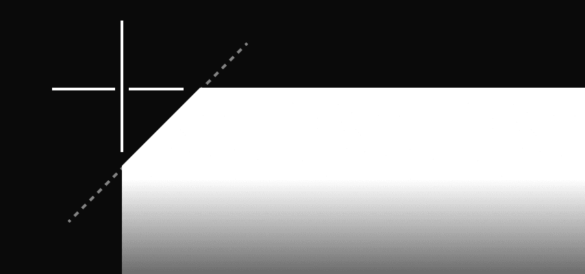


Create notched/angled cornered backgrounds. Lots of options, great for Sci-fi UI's.
This one’s pretty niche, but it has a story. I originally built an entirely different version of Framerverse before this one—a version nobody has seen.
The V2 design (yes, there was a V1 too—you know how it goes) was a sci-fi-inspired interface that I spent way too long perfecting. As part of that build, I wanted cards and elements with angled corners that could be controlled without stretching or squishing when the design adapted responsively.
I tried countless methods—SVGs, masks, all sorts of tricks—until I created this component. It works brilliantly, offers loads of functions, and is perfect if you need angled corners as backgrounds in your design.
Enjoy!
If you are not sure how to add code to Framer watch this quick video.
Framer Code Component
Sci-Fi Angled Corners
2.4
2.4
2.4
2.4
// A custom code component by Chris Kellett - Framerverse.com
// Get more components at www.framerverse.com
// Sci-Fi Angled Corner Component for Framer
// Version: 2.4

import React from "react"
import PropTypes from "prop-types"
import { Frame, addPropertyControls, ControlType } from "framer"

/**
 * @framerSupportedLayoutWidth fixed
 * @framerSupportedLayoutHeight fixed
 */
export function Notched(props) {
    const {
        notchSize,
        notchTopLeft,
        notchBottomLeft,
        notchTopRight,
        notchBottomRight,
        fillType,
        color,
        opacity,
        gradientStartColor,
        gradientEndColor,
        gradientAngle,
        gradientType,
        children,
        style,
        ...rest
    } = props
    const sizePx = `${notchSize}px`
    const tl = notchTopLeft ? sizePx : "0px"
    const tr = notchTopRight ? sizePx : "0px"
    const br = notchBottomRight ? sizePx : "0px"
    const bl = notchBottomLeft ? sizePx : "0px"
    const clipPathValue = `polygon(
    ${tl} 0,
    calc(100% - ${tr}) 0,
    100% ${tr},
    100% calc(100% - ${br}),
    calc(100% - ${br}) 100%,
    ${bl} 100%,
    0 calc(100% - ${bl}),
    0 ${tl}
  )`
    const background =
        fillType === "solid"
            ? color
            : gradientType === "linear"
              ? `linear-gradient(${gradientAngle}deg, ${gradientStartColor}, ${gradientEndColor})`
              : `radial-gradient(circle, ${gradientStartColor}, ${gradientEndColor})`
    return (
        <Frame
            {...rest}
            style={{
                ...style,
                width: "100%",
                height: "100%",
                clipPath: clipPathValue,
                background,
                opacity,
            }}
        >
            {children}
        </Frame>
    )
}
Notched.defaultProps = {
    width: 90,
    height: 60,
    color: "#FFFFFF",
    notchSize: 20,
    opacity: 1,
    fillType: "solid",
    gradientStartColor: "#FF0000",
    gradientEndColor: "#0000FF",
    gradientAngle: 0,
    gradientType: "linear",
    notchTopLeft: false,
    notchTopRight: false,
    notchBottomLeft: false,
    notchBottomRight: false,
}
Notched.propTypes = {
    notchSize: PropTypes.number,
    notchTopLeft: PropTypes.bool,
    notchBottomLeft: PropTypes.bool,
    notchTopRight: PropTypes.bool,
    notchBottomRight: PropTypes.bool,
    fillType: PropTypes.oneOf(["solid", "gradient"]),
    color: PropTypes.string,
    opacity: PropTypes.number,
    gradientStartColor: PropTypes.string,
    gradientEndColor: PropTypes.string,
    gradientAngle: PropTypes.number,
    gradientType: PropTypes.oneOf(["linear", "radial"]),
    children: PropTypes.node,
    style: PropTypes.object,
}
addPropertyControls(Notched, {
    fillType: {
        type: ControlType.Enum,
        title: "Fill Type",
        options: ["solid", "gradient"],
        defaultValue: "solid",
    },
    color: {
        type: ControlType.Color,
        title: "Color",
        hidden: (props) => props.fillType === "gradient",
    },
    gradientType: {
        type: ControlType.Enum,
        title: "Gradient Type",
        options: ["linear", "radial"],
        defaultValue: "linear",
        hidden: (props) => props.fillType === "solid",
    },
    gradientEndColor: {
        type: ControlType.Color,
        title: "Gradient End",
        hidden: (props) => props.fillType === "solid",
    },
    gradientStartColor: {
        type: ControlType.Color,
        title: "Gradient Start",
        hidden: (props) => props.fillType === "solid",
    },
    gradientAngle: {
        type: ControlType.Number,
        title: "Gradient Angle",
        min: 0,
        max: 360,
        step: 1,
        hidden: (props) =>
            props.fillType === "solid" || props.gradientType === "radial",
    },
    notchSize: {
        type: ControlType.Number,
        title: "Notch Size",
        min: 0,
        max: 50,
        unit: "px",
        defaultValue: 20,
    },
    notchTopLeft: {
        type: ControlType.Boolean,
        title: "Top Left Notch",
        enabledTitle: "Yes",
        disabledTitle: "No",
        defaultValue: true,
    },
    notchTopRight: {
        type: ControlType.Boolean,
        title: "Top Right Notch",
        enabledTitle: "Yes",
        disabledTitle: "No",
        defaultValue: true,
    },
    notchBottomLeft: {
        type: ControlType.Boolean,
        title: "Bottom Left Notch",
        enabledTitle: "Yes",
        disabledTitle: "No",
        defaultValue: true,
    },
    notchBottomRight: {
        type: ControlType.Boolean,
        title: "Bottom Right Notch",
        enabledTitle: "Yes",
        disabledTitle: "No",
        defaultValue: true,
    },
    opacity: {
        type: ControlType.Number,
        title: "Opacity",
        min: 0,
        max: 1,
        step: 0.01,
        defaultValue: 1,
    },
})
CLICK TO COPY
What is it?
Create notched/angled cornered backgrounds. Lots of options, great for Sci-fi UI's.
What is it?
Create notched/angled cornered backgrounds. Lots of options, great for Sci-fi UI's.
What is it?
Create notched/angled cornered backgrounds. Lots of options, great for Sci-fi UI's.
How to use.
Click in the code are below to copy the code to your clipboard. Then click the 'plus' button int the assets panel for 'Code'. Choose if its an overide or Component. Paste the code in and save.
How to use.
Click in the code are below to copy the code to your clipboard. Then click the 'plus' button int the assets panel for 'Code'. Choose if its an overide or Component. Paste the code in and save.
How to use.
Click in the code are below to copy the code to your clipboard. Then click the 'plus' button int the assets panel for 'Code'. Choose if its an overide or Component. Paste the code in and save.
Usage Licence
I'm happy for you to use this code in your projects, even templates. If you use it please keep my accreditation in the code. Please don't sell it as your own. (Hover for full licence).
Usage Licence
I'm happy for you to use this code in your projects, even templates. If you use it please keep my accreditation in the code. Please don't sell it as your own. (Hover for full licence).
Usage Licence
I'm happy for you to use this code in your projects, even templates. If you use it please keep my accreditation in the code. Please don't sell it as your own. (Hover for full licence).
Change Log
//October 1st 2024
Version 2.4 launched. Tried and tested.
Figma to Framer
Support
If you need support first watch the help video above. If that does not help reach out to me on one of my social channels or use the contact form. As I am a team of one it may take a short while to get back to you. Please be patient, thanks.
Hope this helps. Good luck with your project.
Scan to open on mobile.
More Framer resources.

CMS Drivend Password‑protected Client Pages
Secure any collection page with a drag‑and‑drop lockout that remembers each visitor — no code, no servers, just Framer.
Component

CMS Drivend Password‑protected Client Pages
Secure any collection page with a drag‑and‑drop lockout that remembers each visitor — no code, no servers, just Framer.
Component

CMS Drivend Password‑protected Client Pages
Secure any collection page with a drag‑and‑drop lockout that remembers each visitor — no code, no servers, just Framer.
Component

Dynamic QR Maker
Easily add auto generated QR codes to anything Framer
Code Component

Dynamic QR Maker
Easily add auto generated QR codes to anything Framer
Code Component

Dynamic QR Maker
Easily add auto generated QR codes to anything Framer
Code Component

Orb Background
A very cool background effect great for startups.
Code Component

Orb Background
A very cool background effect great for startups.
Code Component

Orb Background
A very cool background effect great for startups.
Code Component

Popup Advert Kit for Framer
Everything you need to start adding and running professional popup ads on Framer sites.
Kit

Popup Advert Kit for Framer
Everything you need to start adding and running professional popup ads on Framer sites.
Kit

Popup Advert Kit for Framer
Everything you need to start adding and running professional popup ads on Framer sites.
Kit
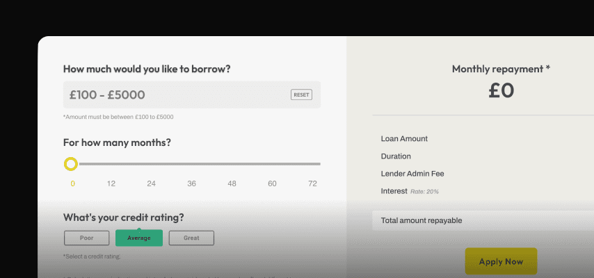
Real Loan Calculator
Add a fully functional, responsive, configurable loan calculator to your project.
Section

Real Loan Calculator
Add a fully functional, responsive, configurable loan calculator to your project.
Section

Real Loan Calculator
Add a fully functional, responsive, configurable loan calculator to your project.
Section
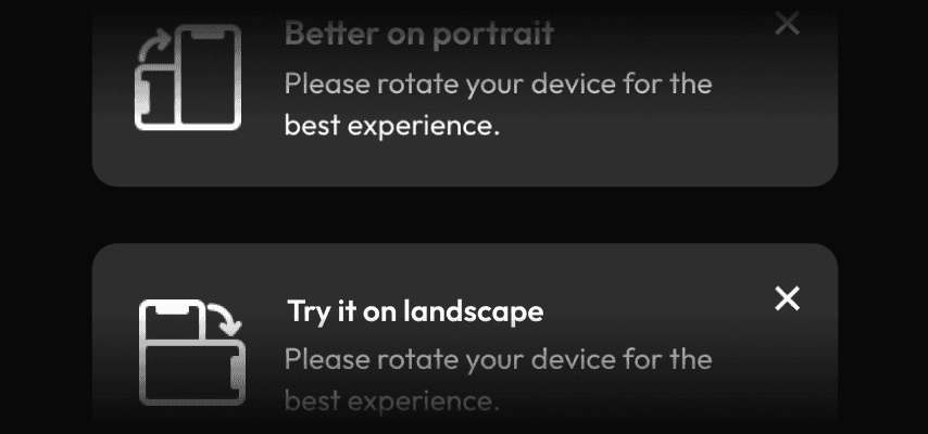
Mobile Rotation Alert
If your site works better in one orientation than another why not let your users know with this little component.
Code Component

Mobile Rotation Alert
If your site works better in one orientation than another why not let your users know with this little component.
Code Component

Mobile Rotation Alert
If your site works better in one orientation than another why not let your users know with this little component.
Code Component