Back
Back
Back
Swipe Variant Changer
Swipe Variant Changer
Page Contents
Page Contents
Page Contents



Use this component and overide combo to create a swipe toggle that switches component variants.
If you've ever needed a swipe toggle for a website and thought, "I'll just use the drag option effect in Framer," only to find it didn’t work as expected—this is the solution you’ve been looking for.
I built this code override and component combo to support a community member, then realized it would be perfect to release on Framerverse.
Simply get the remix link, open it in your version of Framer, and explore how it’s built. Everything is customizable in Framer; the override seamlessly integrates, making everything work smoothly.
This is ideal for mobile sites or any site where you want to add a swipe toggle. Hope you find it useful—you're welcome!
If you are not sure how to add code to Framer watch this quick video.
Swipe Variant Changer
Framer Code Overide
1.1
1.1
1.1
1.1
// A custom Framer code override by Chris Kellett and input from Michiel Knoppert - Framerverse
// Get more components at www.framerverse.com
// Swipe and Variant Management Override
// Version 1.1

import { Override, Data, motionValue } from "framer"
import { createStore } from "https://framer.com/m/framer/store.js@^1.0.0"
import type { ComponentType } from "react"

// Step 1: Set up the store with default variants and last position
const useStore = createStore({
    slideVariant: "v1", // Default variant for sliding component
    topVariant: "t1", // Default variant for top component
    lastPosition: 0, // Initial last x-position for swipe logic
})

// Step 2: Higher-Order Component (HOC) to pass the slide variant to the component
export function withSlideVariant(Component): ComponentType {
    return (props) => {
        const [store] = useStore()
        return <Component {...props} variant={store.slideVariant} />
    }
}

// HOC to pass the top variant to the component
export function withTopVariant(Component): ComponentType {
    return (props) => {
        const [store] = useStore()
        return <Component {...props} variant={store.topVariant} />
    }
}

// Step 3: Swipe Override for the slide button
const data = Data({
    x: motionValue(0), // Initial x-position for swipe
    dragConstraints: { left: 0, right: 180 }, // Drag boundaries for swipe
})

// Override for the swipe component that responds to drag events
export function Swipe(): Override {
    const [store, setStore] = useStore()

    return {
        drag: "x", // Enable horizontal dragging
        dragConstraints: data.dragConstraints, // Set drag constraints
        x: data.x, // Bind x-position to data state
        onDragEnd: (event, info) => {
            const { x } = info.point // Get the final x-position
            const swipedRight = x > store.lastPosition

            // Restrict swipe direction based on current slide variant
            if (
                (store.slideVariant === "v1" && !swipedRight) || // Prevent left swipe when at v1
                (store.slideVariant === "v2" && swipedRight) // Prevent right swipe when at v2
            ) {
                return // Do nothing if the swipe is not allowed
            }

            // Update the store based on swipe direction
            setStore({
                ...store,
                slideVariant: swipedRight
                    ? store.slideVariant === "v1"
                        ? "v2"
                        : "v1"
                    : store.slideVariant === "v2"
                      ? "v1"
                      : "v2",
                topVariant: swipedRight ? "t2" : "t1",
                lastPosition: x, // Save the last x-position
            })
        },
    }
}

// Step 4: Override for the top component with instant switching
export function TopComponentSwipe(): Override {
    const [store] = useStore()

    return {
        variant: store.topVariant, // Bind variant to top variant in store
        transition: { duration: 0 }, // Instant transition on variant change
    }
}

// Example component to demonstrate usage
const MyComponent = (props) => {
    return <div>Current Slide Variant: {props.variant}</div> // Displays current slide variant
}

const TopComponent = (props) => {
    return <div>Current Top Variant: {props.variant}</div> // Displays current top variant
}

// Wrap the components with the HOCs
export const WrappedMyComponent = withSlideVariant(MyComponent) // Component with slide variant
export const WrappedTopComponent = withTopVariant(TopComponent) // Component with top variant
CLICK TO COPY
What is it?
Use this component and overide combo to create a swipe toggle that switches component variants.
What is it?
Use this component and overide combo to create a swipe toggle that switches component variants.
What is it?
Use this component and overide combo to create a swipe toggle that switches component variants.
How to use.
Click in the code are below to copy the code to your clipboard. Then click the 'plus' button int the assets panel for 'Code'. Choose if its an overide or Component. Paste the code in and save.
How to use.
Click in the code are below to copy the code to your clipboard. Then click the 'plus' button int the assets panel for 'Code'. Choose if its an overide or Component. Paste the code in and save.
How to use.
Click in the code are below to copy the code to your clipboard. Then click the 'plus' button int the assets panel for 'Code'. Choose if its an overide or Component. Paste the code in and save.
Usage Licence
I'm happy for you to use this code in your projects, even templates. If you use it please keep my accreditation in the code. Please don't sell it as your own. (Hover for full licence).
Usage Licence
I'm happy for you to use this code in your projects, even templates. If you use it please keep my accreditation in the code. Please don't sell it as your own. (Hover for full licence).
Usage Licence
I'm happy for you to use this code in your projects, even templates. If you use it please keep my accreditation in the code. Please don't sell it as your own. (Hover for full licence).
Change Log
// Version 1.1 Updated swipe right state with input from Michiel Knoppert
// Version 1.0
Figma to Framer
Support
If you need support first watch the help video above. If that does not help reach out to me on one of my social channels or use the contact form. As I am a team of one it may take a short while to get back to you. Please be patient, thanks.
Hope this helps. Good luck with your project.
Scan to open on mobile.
More Framer resources.

CMS Drivend Password‑protected Client Pages
Secure any collection page with a drag‑and‑drop lockout that remembers each visitor — no code, no servers, just Framer.
Component

CMS Drivend Password‑protected Client Pages
Secure any collection page with a drag‑and‑drop lockout that remembers each visitor — no code, no servers, just Framer.
Component

CMS Drivend Password‑protected Client Pages
Secure any collection page with a drag‑and‑drop lockout that remembers each visitor — no code, no servers, just Framer.
Component

Dynamic QR Maker
Easily add auto generated QR codes to anything Framer
Code Component

Dynamic QR Maker
Easily add auto generated QR codes to anything Framer
Code Component

Dynamic QR Maker
Easily add auto generated QR codes to anything Framer
Code Component

Orb Background
A very cool background effect great for startups.
Code Component

Orb Background
A very cool background effect great for startups.
Code Component

Orb Background
A very cool background effect great for startups.
Code Component

Popup Advert Kit for Framer
Everything you need to start adding and running professional popup ads on Framer sites.
Kit

Popup Advert Kit for Framer
Everything you need to start adding and running professional popup ads on Framer sites.
Kit

Popup Advert Kit for Framer
Everything you need to start adding and running professional popup ads on Framer sites.
Kit
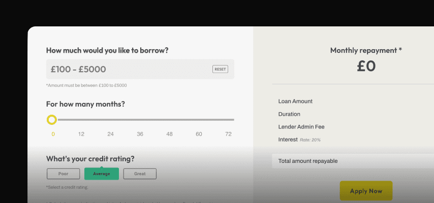
Real Loan Calculator
Add a fully functional, responsive, configurable loan calculator to your project.
Section

Real Loan Calculator
Add a fully functional, responsive, configurable loan calculator to your project.
Section

Real Loan Calculator
Add a fully functional, responsive, configurable loan calculator to your project.
Section
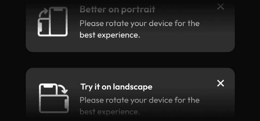
Mobile Rotation Alert
If your site works better in one orientation than another why not let your users know with this little component.
Code Component

Mobile Rotation Alert
If your site works better in one orientation than another why not let your users know with this little component.
Code Component

Mobile Rotation Alert
If your site works better in one orientation than another why not let your users know with this little component.
Code Component